
You are currently browsing the category archive for the ‘Goodworks1 Revisited’ category.
In fact, I think the main reason I have any interest in quilting is due to the chance to be audacious (is that the right word?) in my use of color.
Once I started a wall hanging for elderly friends just because I was fascinated by all the different green colors in their main bathroom. Aqua-greens, mint greens, olive and avocado greens, 50s light greens, forest greens — it was amazing.
I started a search for green fabrics that incorporated both yellow greens and bluish greens. There weren’t too many in the mid nineties! I did a mockup on a foam core board for them because I was so excited about the concept.
Well, that was a mistake. It was clear that either I was NOT communicating my vision or they did NOT appreciate the product.
In any case, I never finished it and I think it’s probably still leaning against the wall behind a stack of fabrics in my sewing room, 12 years later.
——-
Closing with a view of a favorite child in green!

Halloween 2010
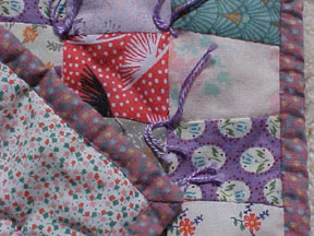
I love mystery quilts, but I’m terrible at following through on finishing them once the mystery is solved and I know how it will look. I finished this one while on vacation last summer. For several years I thought I might extend this 8-sided center to a bed-sized quilt, but decided I’d rather have it finished than possibly on a bed some day in the future.
The front:

I found this mystery on the web sometime in the last 8 or 9 years. If you recognize the pattern or author of the mystery, please leave a comment so I can give that person credit. (February 2010: I found it! Quilting Passion Mystery Quilts Scroll down. It’s Mystery Quilt #1.) I chose scraps from several of the batiks that we used for tablecloths at my daughter’s wedding in 2000. Here’s the back, which gives you an allover view of the ‘focus’ fabric.

A close-up where you can see my rough free-form quilting as I was learning to use my new-to-me Bernina 1090 sewing machine:

The photos were taken outside with my old Sony Mavica FD-75. The quilt is about 40 inches across.
Another ‘blast from the past’ to keep a record of these projects all in one place. Unfortunately I didn’t take regular photos as I painted and decorated, but I do have a few which I have posted below. This first one was taken at night.

Advent 2005, Christmas and Epiphany Sundays at Willow Springs Mennonite Church, based on the series by the Mennonite Church Advent Writing team from Saskatchewan as published in the Leader and the Mennonite Bulletin Series, Faith & Life Resources, cover designs by Grant Unrau.
Each week had a theme phrase and a flower:
God’s Unstoppable Purpose…
…Surprises! – Crocus – God meets us when we least expect it.
…Is Faithful! – Cactus – God is faithful when we cry out.
…Restores! – Clematis – God restores and transforms our world.
…Invites! – Orchid – God invites us into the story.
…Is Unimaginable! – Poinsettia – God comes to live with us.
…Breaks Forth Anew! – Sunflower – God in history, God’s future.
Each week I added one new purple flower (based on the bulletin covers) to the blank natural canvas banner. For each Sunday of Advent: crocus, cactus, clematis, then orchid.

Purple Flowers Advent 2005 Bulletin Covers
Then for Christmas Sunday, a red poinsettia.
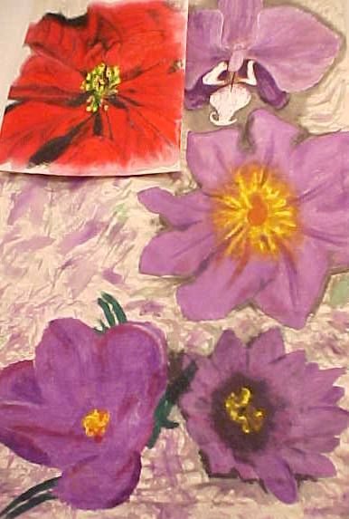
For Epiphany Sunday, a yellow sunflower.

Bulletin Covers Advent 2005
I used Dharma’s pigment dye painted directly on natural canvas. I thickened some of the liquid pigment; also used an opaque white under any yellow and white parts of the flowers. About halfway through December someone asked if I could adapt the purple flowers in this banner as the basis for their wedding banner, so I painted the poinsettia and sunflower on a separate piece of canvas.
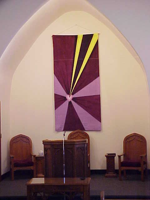
Advent wreath. We started with a plain wreath and candles. Some purple tinsel was added each week of Advent. Christmas Sunday I added the red stars; Epiphany Sunday I added gold stars.

Here’s a view of the whole thing, including the sunflower added for Epiphany Sunday. You can see the purple velour, red knit ribbed fleece, and the yellow silk charmeuse scarf on the podium and the gold stars that had been added to the Advent Wreath.
My sister cut these square denim blocks a few years ago, in 2003, I think. We did a rag quilt style pillow for our father (who loves walleye fishing in Ontario).
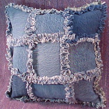
As you can see the pillow includes some olive green denim and a ‘fisherman’ type block salvaged from an old sweatshirt that once belonged to one of his grandsons.
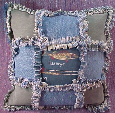
We were on a real denim kick! One day soon I’ll show you the denim ‘picnic’ quilt that inspired all this…
Elaine
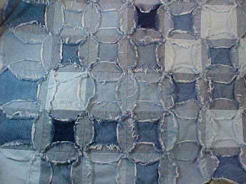
My sister cut all these circles from old jeans. We started with a small plate to cut around with the rotary cutter. Skinned knuckles are a hazard of this method. We switched to drawing around the template and cutting with a scissors. It’s a more portable project that can be done while watching a soccer practice or game…
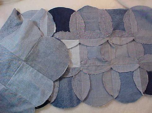
After washing:
Sometimes in the winter my dh likes to hop in his semi truck and haul stuff around the country for hire. Several years ago his truck of choice was a red Mack tricked out to haul flat bed and/or wide or heavy loads.
Bedding for the sleeper cab is always a challenge as the custom mattresses vary according to the size of the truck. My solution has been to buy a dark colored cotton California King sized sheet set and recut it to fit the bed. That usually works for the sheets, but then the blankets are a different problem. No standard blanket is long enough for the bed and if they are long enough, they are generally too wide.
I planned this quilt with a few parameters in mind. It needed to be dark enough to not show dirt easily, quickly and easily pieced, related somehow to the truck colors (red with black interior), and something a man would be willing to sleep under. lol
I collected a variety red fabrics, from orange-red to blue-red, but with no white. Then I found an older Jinny Beyer grey and red border fabric that would work for sashing and borders. The piecing of the red fabrics was of random width Chinese coins, with the sets rearranged as I pieced them. The final decisions on the arrangement of the reds was done while lying in bed recovering from some broken bones. (This is starting to seem like a theme…) The borders were added with no fancy mitering…this is a utility quilt.
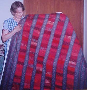
I have only this one photo after my mother-in-law and I had tied it and just taken it out of her floor frame, but before the edges were finished.
Getting better photos of those gorgeous fabrics is on my to-do list.
DH’s winter job has some side benefits for me; a couple winters ago he stopped and picked up a Bernina sewing machine that I had purchased on PatternReview.com from a gal in Denver. ‘Free’ delivery!
I found these photos on my computer last week and thought I’d share them with you. I seem to be a magnet for people’s unwanted textiles.
A small stack of scissor cut tumbler blocks was given to me about 7 years ago. I had never pieced this block before, so I decided to give them a try.
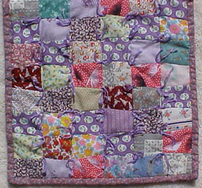
The fabrics weren’t my favorites and I suspected by the way they smelled when pressing that some of them were partly polyester, so I decided to do a quick tie job instead of quilting. Also I have a doll quilt from the early 1950s that was tied, so I figured this finish would fit this little quilt.
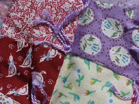
I found some pieces (from a different era, however) in my stash for the backing and binding.
I think I probably sold this quilt, but I can’t really remember…
1994: I had finally completed Nancy Mirman’s Kandu Coat.  I chose my sister’s favorite colors, teal-green and purple, for the top of the jacket and gradually darkened the jacket to navy and black at the bottom so she could wear it with either color for work. (Well, okay, it really isn’t corporate enough…)

I enlarged the pattern slightly by choosing strips that were about 1/4 inch wider than the pattern suggested. I was on a mission to use all types of fabrics styles in my projects, so you can see all sorts of oddities if you look closely at the choices. My only regret is using a rayon challis print. Otherwise the fabrics are all cotton. The base fabric was a miswoven tattersall oxford shirting that I must have found on the 50 cent table at Hancock’s in the mid 1980s when I was so strapped for cash that I was vulnerable to the call of inexpensive but truly weird fabrics… lol. In any case, I had several major surgeries from 1993-94 so I had plenty of couch time to view this on the ‘design wall’ (a flannel covered cutting mat leaned against a chair.)

You can see a bit of the silk lining above the label I put on the inside back hem band. The jacquard lining is very comfortable and made me vow to always use silk to line jackets.


I added shoulder pads between the jacket and the lining to keep the jacket in position on my sister’s sloping/forward shoulders. Currently I’m the one who wears this jacket even though the colors are not the most flattering. The shoulder pads are somewhat too large and positioned too far forward for me, but I haven’t been worried about it enough to change them yet. If I were ever inclined to make another Kandu Coat / jacket just for me, I would lengthen both the body and the sleeves. Even with the cuffs folded down, the sleeves on this jacket don’t reach my wrists.
One fun and unexpected aspect of this jacket is that you can store small objects in the underarm area of the sleeve. This is a common thing, I think, with kimono, but this pattern doesn’t have that bag-shaped sleeve, so I was surprised to find how secure things were when stashed there. lol.
About 15 years ago I found some linen-cotton blend woven fabrics on the $1.00/yd sale table (solid colors in black, navy, red, light green, off-white) and decided to make four-gored flared Swishy** skirts with as wide a hem as I could manage, given the width of the fabric.
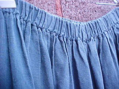
Now it’s been decades since I took a geometry class, but I figured if I made the bottom of the skirt the width of the fabric minus the selvedge, measured the length I wanted and added extra for a machine-stitched hem and a fold-over casing for the waist elastic, and made the top measurement my hip measurement divided by four, I’d be close to the desired shape. (Vertical grainline centered on the pattern piece. And I personally scoop out an inch or two from the back center of the waistband to keep the back hem from sagging.)
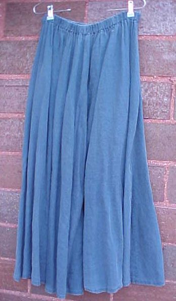
What I found was that one skirt like this would take a purchase of nearly 6 yards of fabric! The linen/cotton blend fabric did shrink some when prewashed and machine dried. It softened up beautifully. The weight of the skirt helps it hang in soft folds and I rarely have to iron these skirts unless they are packed tightly in a suitcase for a long time.
After making 3 black skirts, one navy and one light green skirt from this fabric (which is similar to the Essex blend sold at Dharma Trading) I started to think this was the ideal skirt pattern for everyone.
So I hit all the Walmart stores within a 60 mile radius and then cranked out a bunch for gifts. All 6 of the adult women in my family got one. That’s how I learned to THINK before doing such a project again! lol.
The actual drafting/cutting and sewing was really not an issue. I was using the 4 thread option on my serger for all the seams and the edge finishing before folding the hem and casing and machine stitching them. I never ‘thread’ elastic, but add it as I sew the casing.
The problem was that most of the women were not flattered by a skirt with that long lower-calf length and flared shape. No doubt those gifts hit the thrift shops or rag bags many years ago.
A couple of mine have been cut up for rags too, since I actually wore them out. I’m pretty hard on clothing – these tend to get caught on nails and other stuff and get holes torn in them.
However, the design is still a favorite of mine, although sometimes now I sew the hip portion a little narrower and flare the bottom out to my preferred circumference. I’ve contemplated changing the style to add godets. Rusty Bobbin has a blog tutorial on how to draft your own multi-gored skirt with more accurate calculations that would make it easier to follow than my description above.
I’ve used 100% linen a couple times; I love the soft sueded look the linen gets as it’s worn. Luckily that softer look/coloration is flattering to my low-contrast eye/hair/skin colors.
These are quite comfortable to wear in warm weather and are opaque enough (in the darker colors) that no under layer is needed. They can also be layered with cotton tights and underskirts/slips for cooler days, although that adds some apparent bulk to the hips.
I guess I should check through my fabrics and see what could be used for a new skirt. I think I’ll try more gores this time. Or I’ll change the 4 gored skirt so the center back is not on a seam, but rather is the center of one of the panels; I think the skirt will hang more closely over the hip area with this change. I’ve also considered painting some sort of design on the fabric itself.
**Swishy skirt: So named by my husband’s aunt Betty. Whenever she catches me in pants, she laments that I haven’t worn one of her favorite ‘swishy’ skirts. lol.
Here’s the followup photo of the Lenten banner I discussed earlier.

I took photos today with several different camera settings, finding that the colors are rendered slightly differently on each. Here’s the picture that inspired our version, from the Leader, Winter 2003, I think.
I will put my law in their minds and write it on their hearts. I will be their God, and they will be my people. Jeremiah 31:33b
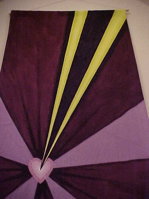
At the time I hadn’t learned to use resists with the pigment dyes, so I was working on dry canvas, trying various methods to keep the colors from running together when I didn’t want them combined. I painted an opaque white under the yellow and under the heart section.

I really wanted the ray of light/pen to pop out, so I used a fluorescent yellow with just a touch of green in the centers of the rays.

I was also trying to suggest that the pen that is ‘writing on the heart’ is pressing down on the surface; thus the lines radiating from the dark burgundy heart.
The hardest part of painting banners for my own congregation is that it’s hard to stop ‘working’ on it. I still sit in church sometimes and consider how I might have changed some part of the process.
In this particular case, the rod holding the banner is in great need of an overhaul. And the bottom of the banner was finished mostly with ironed-on Wonder-Under; not a finish that was expected to last through multiple hangings and manipulations over more than 5 years. So one of these days I’ll need to work on some repair/rehabilitation for this project.


Thanks for your comments!